Client View & DHCP Visibility Changes

Hi all,

We’re pleased to announce a couple of changes to the Controller UI. These changes are live on the Cloud Management already and will be rolling out to local Controller installations within the next week.

Note that the following features are only available if you are using an Alta Labs Router.


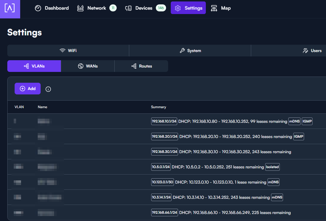
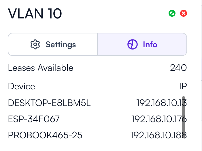
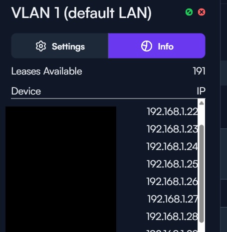
DHCP Lease Information

You can now see how many leases are remaining for each VLAN’s DHCP pool

Go to Settings > Networks > VLANs to see this view

Further Detail

If you click on one of those VLANs, you’ll now see a list of all DHCP clients on that specified VLAN under the info tab


(Thanks to @jmszuch for catching this detail missed from the original announcement)


DHCP Lease Time Remaining

A new filter has been added under the Clients view, “Lease Ends”


Which will show you when the DHCP lease for a given client will expire, assuming it has an active lease

To see this, go to Clients > Options > Scroll to “Lease Ends”


DHCP Only Filter

This will show only clients that are known via DHCP. Additionally, you can further filter by specifying a VLAN.

To see this, go to Clients > Options > Scroll to DHCP Only


VLAN Filter

This will show only clients for the specified VLAN

To see this, go to Clients > Options > Scroll to DHCP Only

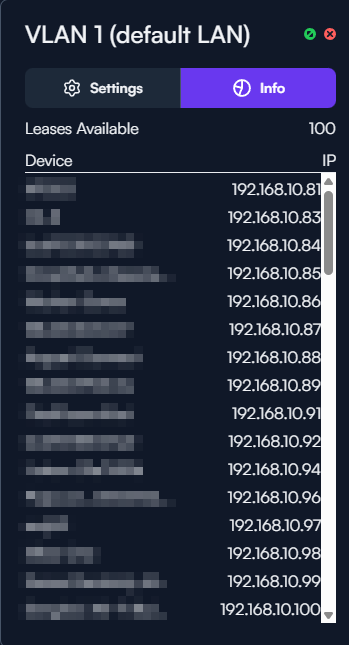
Cool! Time to play around with this a bit, but I now see there’s an info tab under each network displaying a list of assigned IPs as well. At least I don’t recall that tab being there before :smiley:

Good catch @jmszuch. Ironic that I missed that one given it was the very first I checked out :laughing:. I’ll get the post edited in short order.

No worries and thanks!

Just a small critque on this so far @Alta-Matt_v2

I noticed when adding a network now the example in the VLAN field is a little confusing:

As it’s looking for a VLAN ID, not a subnet to enter in and the field won’t accept something like that anyway.

I am liking all the updates but one suggestion for visual quality is to leave space between the text and the scroll bar/slider on the right hand side. Even if using the expanded view the end of the text regularly runs into the slider which while readable is unpleasant on the eyes.

Yes, definitely a +1 on this suggestion!

Thank you for the report, this is resolved in the cloud, and will come to the local controller soon.

Thanks, @Alta-Jeff! I’ll be sure to check it out when I have a moment.

Confirmed! Looks better to me :slight_smile:

image

Thanks again @Alta-Jeff

And just wanted to re-iterate the suggestion from @user54 about adding just a little bit of space between the text/fields and the scroll bar at some point. I feel like that would increase the readability of things in the settings windows and make everything feel a little less smooshed together.

In our testing, the scroll bar disappears automatically. Is it not disappearing for you? You must be on Windows?

Correct! Windows 11 and I’m seeing that behavior in Microsoft Edge and Google Chrome. I have a Mac I can test from as well in a little bit.

Just a quick update on this after some testing. I’ve tested on a few different Windows PCs using Microsoft Edge and have seen the scroll bars stay in place. Also tested on a Mac Mini using Microsoft Edge running MacOS 26 and seen the same behavior. Same in Chrome and Firefox as well, although Firefox displays the scrollbars much thinner.

Oddly enough though, the scrollbars disappear automatically on a MacBook running MacOS 26 and in Microsoft Edge. Haven’t tested that in additional browsers on the MacBook yet but was just suprised to see the correct behavior on one out of a few different computers.

Not a major problem, of course, but I just wanted to check in with those findings so far.